Page 2 of 3
Posted: Sat Dec 01, 2007 6:29 am
by Andymac84
Wow,these are great pics.
I can't wait to see the new movie.
He's back --- no question.... And he looks like we know him

Max,your vintage flashlight looks really good to me.It should be in your satchel

Posted: Sat Dec 01, 2007 6:31 am
by Andymac84
On the first pic above...
Is there a backpack on his back?
Posted: Sat Dec 01, 2007 7:03 am
by Indiana Max
Some kind of backpack Yeah

Posted: Sat Dec 01, 2007 7:54 am
by gobo
If someone had showed me that first pic and told me it was from an abandoned sequence in TLC, I probably would have believed it. He looks exactly the same, apart from the snappier fedora.
Posted: Sat Dec 01, 2007 10:08 am
by Mark Brody
I just noticed that his pants are very poorly hemmed in that third picture. Whose his tailor, Quasimodo?
Posted: Sat Dec 01, 2007 7:44 pm
by Treadwell

nice Roger Rabbit ref.
Posted: Sun Dec 02, 2007 3:52 pm
by jjkillin
Really really like these pics.
Dunno if anyone's brought it up before, but he probably wears the bag outside of the jacket these days because wearing it inside nearly got him killed in Last Crusade?
Just a thought!
Posted: Sun Dec 02, 2007 9:17 pm
by Treadwell
Ever notice it was an editing trick that got the strap around the barrel to begin with? There really wasn't any way that could've actually happened.
Posted: Sun Dec 02, 2007 9:38 pm
by Canada Jones
This is a great looking flashlight. How old is it and how much was it? thanks
Canada
Posted: Mon Dec 03, 2007 2:54 am
by Jens
Treadwell wrote:Ever notice it was an editing trick that got the strap around the barrel to begin with? There really wasn't any way that could've actually happened.
Yes, indeed! And their even was a way to release the strap from that barrel as easy as shown.
Posted: Mon Dec 10, 2007 10:16 am
by Mulceber
I have to say, that hat is looking pretty crappy...thank god that isn't a photo, but just an artist's interpretation. :junior: -IJ
Posted: Mon Dec 10, 2007 10:26 am
by coronado3
I can't wait for the Adventurebilt flashlight to hit the streets!
C3
Posted: Mon Dec 10, 2007 10:45 am
by The Pilot
Indiana Max wrote:I have one of those old vintage flashlights (the second picture shows mine), got it last year in England. I think it is quite similar to the one he uses in this scene. What do the specialist think about it

:

Here's a link to the flashlight thread.
Posted: Mon Dec 10, 2007 11:50 am
by Red Dust
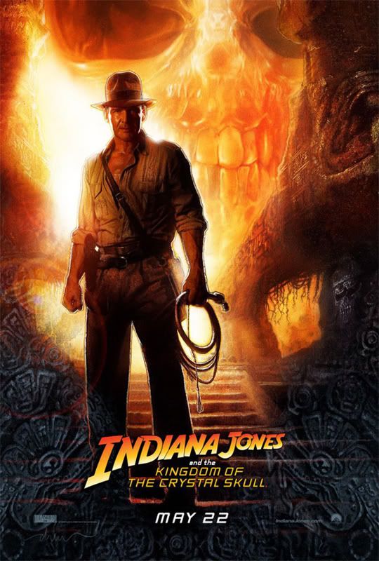
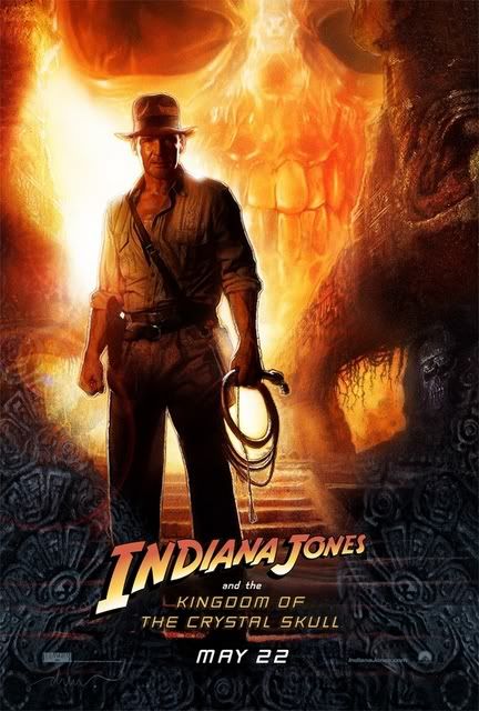
the hat in the poster looks way to broad for harrison's head... i don't recon that it was a true representation of what he was wearing.. i just think it could of been an artistic mistake. in my opinion. plus has any noiced that the INDIANA JONES writing looks a slight bit different. the D looks alittle of shape.
Posted: Mon Dec 10, 2007 1:23 pm
by Panama Tom Jr.
Yeah, the hat looks broad and a little short...
Posted: Mon Dec 10, 2007 1:24 pm
by Fedora
I am glad the film hat does not look like the poster hat. That is one out of proportion ugly hat. Looks wider than his head. Fedora
Posted: Mon Dec 10, 2007 1:47 pm
by Canyon
Wow!

That's a gorgeous poster! I LOVE the colours!

Posted: Mon Dec 10, 2007 7:04 pm
by Mark Brody
There! Fixed THAT problem.

In all seriousness, however, Drew Struzan is an incredible artist. I love all the work he's done for Indiana Jones in the past (and the dozens of other movies he's painted for), but even I must admit that he missed the mark on Indy's hat here.
Posted: Mon Dec 10, 2007 8:01 pm
by RobbyT43
Mark Brody wrote:
In all seriousness, however, Drew Struzan is an incredible artist. I love all the work he's done for Indiana Jones in the past (and the dozens of other movies he's painted for), but even I must admit that he missed the mark on Indy's hat here.
Perhaps that flaming skull behind him engulfed his AB, so he had to wear a DP instead


Posted: Mon Dec 10, 2007 9:00 pm
by Jaredraptor
Mark Brody wrote:There! Fixed THAT problem.

In all seriousness, however, Drew Struzan is an incredible artist. I love all the work he's done for Indiana Jones in the past (and the dozens of other movies he's painted for), but even I must admit that he missed the mark on Indy's hat here.
I'm TOTALLY gonna buy multiple prints of that poster once they become available.
Well, if your modified version were available, I mean. The original...........nope.
Posted: Mon Dec 10, 2007 10:14 pm
by Mark Brody
Could it be that Ford was wearing a DP for the photo this is based on?
Posted: Mon Dec 10, 2007 10:16 pm
by Pitfall Harry
Looks like everyone is doing their own version of the poster. I posted this over in the Indy 4 section.

I couldn't stand seeing the AB represented like that. Even though we all know Struzan couldn't have been using the movie AB for referenece when he painted this poster.
Posted: Mon Dec 10, 2007 11:10 pm
by Pitfall Harry
It's not just the hat though.....it's the font! What did they do to the font??!!! Ahhhhhhhhhh!

Posted: Mon Dec 10, 2007 11:26 pm
by Mulceber
Pretty good Harry. I think you exaggerated the reverse taper just a little too much though. Try make it just a little more straight-sided. :junior: -IJ
Posted: Mon Dec 10, 2007 11:31 pm
by Mark Brody
It seems Harry and I took different approaches. Harry has the epitome of the Indy fedora (Raiders inspired). I just wanted to fix that crown. I must say, I love that hat, Harry!
Posted: Tue Dec 11, 2007 12:23 am
by Pitfall Harry
Well, then why did the release the title I used on the "touch up" a few months back and put that on the T-shirts like the one Canyon bought if they were going to switch to the new title font on the original poster?
Man, that's a long question.

I'm not going to mess with it anymore. I already feel like I'm trampling all over Drew's art by messing with it. I'm a big fan of his work. I just couldn't sit there and stare at that hat for long.....it was making my eyes bleed.

Posted: Tue Dec 11, 2007 12:26 am
by Pitfall Harry
Mark Brody wrote:It seems Harry and I took different approaches. Harry has the epitome of the Indy fedora (Raiders inspired). I just wanted to fix that crown. I must say, I love that hat, Harry!
Thank you.

I'm sure the hat in the film won't look like that either but we've all seen the movie stills and it looks nothing like the original posters hat, that's for sure.
Hey, if there saying this film is closer to Raiders than the others then let's give the posters a Raiders feel.
This one though feels more like Temple of Doom though.

Posted: Tue Dec 11, 2007 9:00 am
by Mark Brody
Since this is only a teaser poster, doesn't that mean we should expect another one to come out in the next few months? I can only ever recall Drew actually painting one poster for any one movie, so that makes it sound like "no".
On the other hand, this IS a teaser poster (which means the real poster is yet to come) and it does not fit the bill of an Indiana Jones poster. ToD and LC were both collages (so was Raiders, but that wasn't Drew). I was expecting just a headshot of Indy with all the supporting characters and bad guys surrounding him on the borders.
I hope we can expect another poster to come, and when it does (knock on wood) I hope it's much easier on the eyes.
Posted: Tue Dec 11, 2007 9:10 am
by Michaelson
Well, to that I have to say, not necessarily.
The ONLY Temple of Doom poster I EVER saw posted on a theater side wall was the one of Indy standing in profile in the Temple, just like this one.
Jonsey has posted a great side by side comparison in the 'new poster' thread in the Indy IV area, but I'll not post it here as that's HIS property and not mine to show.....but there are no extra head shots or the like in that one, and it WAS the official poster of TofD.
So, I think this is the official poster myself, especially since it's now being offered as an exclusive from the SW club.
Regards! Michaelson
Posted: Tue Dec 11, 2007 10:07 am
by Mike
LFL has been off and one with their naming 'teaser' and 'release' posters. It started with Star Wars, just text and the SW logo as the teaser poster to get movie goers questioning what was coming. Then they released a full-blown artwork campaign with the release and with subsequent re-released used modified/different posters. Subsequent sequels used "A" and "B", etc. posters...using a re-release SW poster to announce the coming sequel.
With Raiders, there was just the one Amsel poster. When the movie was released in '82, Amsel did another poster which had more of the collage feel and has been used ad nauseam in just about every VHS/DVD release. For ToD, the US mainly saw the 'Temple entrance' poster, with Drew's collage being used for VHS/DVD and some marketing. When LC came along, they teased it with the large Indy image (thus (I believe) becoming the first Indy "teaser" poster), and had the collage for the release.
As they're calling this a teaser poster from the get-go, I'd suspect there's going to be a release poster once the movie hits. I think ol' George learned from the prequels the value of teaser/release posters as its become a highly collectible market.
Posted: Tue Dec 11, 2007 10:44 am
by Fedora
Back to that poster hat. It has a strange radius on the top, not typical of what we sent. Totally off. I must admit, I am somewhat shocked by the appearance of this hat. Since the front pinch is more relaxed than the film hats, this hat looks, pinchwise, like one of the samples we sent. The front pinch started out just like the poster pic, but was changed before we made the run of film hats. This makes me think, the artist used a sample, instead of what they finally decided upon. But, that would not explain the odd radius on the top of the hat. It also looks just a bit tall to what we sent. The poster just makes me cringe. Fedora
Posted: Tue Dec 11, 2007 3:18 pm
by Pitfall Harry
I think a lot of us are shocked by the hat in the poster. I know I kinda went overboard with my version and it doesn't truly represent the hat in the film either. I just couldn't stand looking at it in the original form and I still can't. The same goes for the font in the title as well...
Everything else about it is top notch but I can't look at anything else now. My eyes are constantly drawn right to the hat and the title.

Posted: Tue Dec 11, 2007 8:21 pm
by IndyFan89
Here is my take on what the poster hat should look like:

Posted: Tue Dec 11, 2007 8:46 pm
by McFly
So just like Harry's, but with a more relaxed pinch?
Not bad... that's probably closer to what it *will* look like, but I think Harry's is more like what we wish it *would* look like.
Shane
Posted: Tue Dec 11, 2007 9:01 pm
by Pitfall Harry
I don't think the movie hat's pinch is so far to the left like that and I'm not talking about Indyfan89's version either. I'm talking about the one in the original version. I think someone brought up it looked like it was turned and I agree. Why Struzan painted it turned along with the other anomalies going on with the hat is beyond me.
I went straight for the SOC style with my hat. I know from viewing the movie stills the hat isn't turned and the brim isn't warped. I think the original version has the brim right I just think either the crown is to wide or the brim is to short. So I probably should have just worked on the crown to stay more accurate.
By the way I made a wallpaper for my computer using my "version" of the teaser.....
follow the link if you want to use it....
http://i26.photobucket.com/albums/c122/ ... per_08.jpg
Posted: Tue Dec 11, 2007 11:05 pm
by Tennessee Smith
Harry, I like what you did to the picture, Logo's great. I'm still sick about the font on the poster though. I mean, this poster had to go through some sort of QA, right? Are you telling me no one at LFL could look at it and go "you know something looks a bit off, we should compare it to the OFFICIAL LOGO". I mean they can create dinosaurs, aliens and spaceships, mimick chrome on a transforming robot but they can't photoshop their own Logo?

...and I bought it anyways
](./images/smilies/Indy_wall.gif)
Posted: Wed Dec 12, 2007 12:55 am
by Pitfall Harry
Yeah, you would think someone had to sign off on it before it was released......The whole thing is just odd.
How much do you want to bet someone was standing there wearing the new T-Shirt with the "Official Logo" on it like Canyon owns while they were giving this poster the seal of approval.

I guess it's done now and there's nothing more to be said really. It's out there for sale and all over the place.
It's not like the poster is horrible. It's a very very cool poster that some of us see two minor flaws in. It's doing it's job though. It's getting everyone excited about the film and in the long run that's all that really matters.
I doubt I'll buy it because of my own personal tastes. I am hoping the full theatrical poster that will eventually be released will use the correct font and show off the AB we've seen in the movie stills.
How "Joe Friday's" hat got on Ford's head in the poster will have to remain a mystery for the time being.

Posted: Wed Dec 12, 2007 2:03 am
by McFly

I sat here and FINALLY made one work! What do you guys think of
that hat?

Shane
Posted: Wed Dec 12, 2007 2:58 am
by Dostacos
Jaredraptor wrote:Mark Brody wrote:There! Fixed THAT problem.

In all seriousness, however, Drew Struzan is an incredible artist. I love all the work he's done for Indiana Jones in the past (and the dozens of other movies he's painted for), but even I must admit that he missed the mark on Indy's hat here.
I'm TOTALLY gonna buy multiple prints of that poster once they become available.
Well, if your modified version were available, I mean. The original...........nope.
it looks like there is a drawing of a small skull in the nose cavity.....
Posted: Wed Dec 12, 2007 4:23 am
by 3thoubucks
Lee Marvin just popped into my head when I saw the Kotcs poster.

Posted: Wed Dec 12, 2007 6:12 am
by Caparzo
With Raiders hat...

Posted: Wed Dec 12, 2007 9:40 am
by Mulceber
looks just a bit off...no way you can shift the image so that it's more straight on his head? :junior: -IJ
Posted: Wed Dec 12, 2007 1:24 pm
by Caparzo
Posted: Wed Dec 12, 2007 2:53 pm
by Pitfall Harry
Posted: Wed Dec 12, 2007 3:23 pm
by Panama Tom Jr.
I think we've got a winner!
At least the hat looks better...

Posted: Wed Dec 12, 2007 4:11 pm
by agent5
Why is everyone cutting and pasting all these pics over and over? You can say what you have to say without doing that.
Sorry. Just being very picky.
Posted: Wed Dec 12, 2007 4:55 pm
by Mulceber
Definitely better with regard to the tilt of the hat, Caparzo. The only problem now is that the left side of his hat is shaded while the right side of his face is in the dark...but I guess there's not much to be done about that. I think yours is the best one yet though. :junior: -IJ
Posted: Wed Dec 12, 2007 5:27 pm
by Rook
W-E-B-L-E-Y you ain't got no aliby,
it's WEBLEY! Yeah, yeah, it's Webley!

Well, at least my new moulds won't be going to waste then.

Me so happy.

Russ
Posted: Thu Dec 13, 2007 1:42 am
by Pitfall Harry
There is an "official" (or so it may seem) desktop version of the poster available online. I took it and added the changes I made to the original poster.
Here it is if your interested.......
http://i26.photobucket.com/albums/c122/ ... l_vers.jpg
(Removed image due to size but left link - Moderator)
Posted: Thu Dec 13, 2007 1:58 am
by IndyFan89
It wasn't on the main site.


