


Regards! Michaelson
US Wings Raiders Jacket label ideas
Moderators: Indiana Jeff, Mike, Indydawg
-
Michaelson

- Knower of Things
- Posts: 44540
- Joined: Tue Jun 25, 2002 12:55 pm
- Location: Out here knowing stuff and things and wishing I were with the family at Universal Studios Orlando
Re: US Wings Raiders Jacket label ideas
Ya got a point there, Zane. 
Regards! Michaelson
Regards! Michaelson
-
Indiego Jones

- Vendor
- Posts: 1042
- Joined: Thu Aug 14, 2008 5:27 pm
- Location: Argentina, Rosario
- Contact:
Re: US Wings Raiders Jacket label ideas
I tried to find a different word for original, a synonym...but nothing satisfied me.
To bad, IMO, because ORIGINAL describes pretty much what this jacket is.
Original maker, original design and patterns, original skin (calf)...
I'm sure someone will come up with the perfect label idea!
Let's keep working!
PS: did I allready said I'm enjoying this SO much?!?! Well, I DO!
To bad, IMO, because ORIGINAL describes pretty much what this jacket is.
Original maker, original design and patterns, original skin (calf)...
I'm sure someone will come up with the perfect label idea!
Let's keep working!
PS: did I allready said I'm enjoying this SO much?!?! Well, I DO!
-
Mountaineer

- Dig Leader

- Posts: 584
- Joined: Sat Apr 18, 2009 7:52 pm
- Location: Once the mountains; now the seaside.
Re: US Wings Raiders Jacket label ideas
Thanks for the head's up. Nice news for a long Tuesday.Michaelson wrote:To confirm about the numbers, I was just told there will be 100 calfskin, and 100 striated lambskin earmarked for COW sales only.
There will other sales outside the site,of course, but these listed 200 will be made for COW members only.
Regards! Michaelson
-
Texan Scott
- Legendary Adventurer

- Posts: 5838
- Joined: Sat Jun 21, 2008 8:55 am
- Location: A felt body at rest tends to stay at rest. Sieze the day!
- Contact:
Re: US Wings Raiders Jacket label ideas
In researching the labels from the website, either the Wings logo is used with a black label or the American flag is used. When the Wings logo was used, the logo is always at the top of the label. When the American flag is used, "U.S. Wings" 'r' is simply printed as text. That suggested to me that it mighht be possible to use either/or. If you use the Wings logo tm, it usually is centered at the top of the label. The modified label utilizes the Am. flag at the top, but utilizes 'US Wings' text, registered. Yet, whichever one you use, both utilize the black label.binkmeisterRick wrote:Food for thought: why would we want to alter the US Wings brand in any way? After all, they are providing us with this opportunity—much less the jackets—so it is only fitting that the official US Wings logo be kept as is. JMO
My thought was brand new, anniversay, commemorative, special edition, etc., one of a kind type offering for the jacket and to create a one of a kind type logo to go with the Raiders label. Just throwing out ideas and no certainly no disrespect to any entity.
-
Texan Scott
- Legendary Adventurer
- Posts: 5838
- Joined: Sat Jun 21, 2008 8:55 am
- Location: A felt body at rest tends to stay at rest. Sieze the day!
- Contact:
Re: US Wings Raiders Jacket label ideas
Shaping up! What if under Raiders, instead of "of the Lost Ark" in the same font it read, "DWC 06-12-1981"? The arch 'deal' makes it a little cluttered.
m.s wrote:St. Dumas wrote:Can any of you run up a label design that incorporates the Hawaii mountain peak from the opening shot of Raiders? (I'm not talking about the Paramount mountain, as that would be TM infringement.)
Edit:Again very quick, just to illustrate a rough possible way to include this.Texan Scott wrote:Is there a way to work in the DWC 06/12/1981 text? I wonder how the seraph and "30th" would look as silver, to match the RAIDERS opening credits logo? Maybe a ribbon banner underneath RAIDERS that says, DWC 0612/1981?
-
Tennessee Smith

- Site Admin

- Posts: 10586
- Joined: Mon Jul 02, 2007 3:47 pm
- Location: Everything we need is right here.
Re: US Wings Raiders Jacket label ideas
I like how you have the 30th anniversary on the mercy seat but that might be sacrilegious to some. Awesome label 
-
Gringo
- Archaeologist

- Posts: 233
- Joined: Tue Jul 09, 2002 12:34 pm
- Location: Quoter of Legends and things
Re: US Wings Raiders Jacket label ideas
Really nice Tex S!

Re: US Wings Raiders Jacket label ideas
Again some quick toying around with the idea:Texan Scott wrote:Shaping up! What if under Raiders, instead of "of the Lost Ark" in the same font it read, "DWC 06-12-1981"? The arch 'deal' makes it a little cluttered.
-
Texan Scott
- Legendary Adventurer
- Posts: 5838
- Joined: Sat Jun 21, 2008 8:55 am
- Location: A felt body at rest tends to stay at rest. Sieze the day!
- Contact:
Re: US Wings Raiders Jacket label ideas
Thank you. ms has a great eye for it!Gringo wrote:Really nice Tex S!
....what do you think? The cherub in gold or silver?
Last edited by Texan Scott on Tue Aug 03, 2010 8:46 pm, edited 1 time in total.
-
Texan Scott
- Legendary Adventurer
- Posts: 5838
- Joined: Sat Jun 21, 2008 8:55 am
- Location: A felt body at rest tends to stay at rest. Sieze the day!
- Contact:
Re: US Wings Raiders Jacket label ideas
It takes some imagination, but here goes:
Wooden crate backround on a black label. The black label serves as a boarder. Font is 'old fashioned typewriter' nostalgic script, looks like text has been burned into the crate....
US Wings logo (it would be cool to enlarge the wings and crest, and put "US Wings" inside the upper portion of the crest).
RAIDERS
30th Anniversary
Left side (space) Right side
Neil Cooper design(space)hero jacket
dwc 0612-1981 (space) 9906573
-
Gringo
- Archaeologist
- Posts: 233
- Joined: Tue Jul 09, 2002 12:34 pm
- Location: Quoter of Legends and things
Re: US Wings Raiders Jacket label ideas
I like the middle one, with the gold, black and silver. Cherubs gold of course. Looking good. Boy, this is all great work.Cheers.
-
Cassidy

- Professor of Archaeology

- Posts: 1175
- Joined: Fri Apr 04, 2003 10:24 am
- Location: Oakville, Ontario, Canada...
Re: US Wings Raiders Jacket label ideas
...of course with Dear, old M. making the decision, I'm surprised no one has attempted to curry favour by using his mugg in the logo design. 
Re: US Wings Raiders Jacket label ideas
I really like Castor Dioscuri's idea of the simple, subtle tag, but then they all look great to me.
Has anyone discussed the idea of having the COW logo included on the COW labels?
Ian
Has anyone discussed the idea of having the COW logo included on the COW labels?
Ian
-
Michaelson
- Knower of Things
- Posts: 44540
- Joined: Tue Jun 25, 2002 12:55 pm
- Location: Out here knowing stuff and things and wishing I were with the family at Universal Studios Orlando
Re: US Wings Raiders Jacket label ideas
Asked and replied to one page ago.Michaelson wrote:Nope. Neat idea again, but let's not go down that path. We exist by the good graces of George Lucas. As long as we keep an invisible existance, we're ok....but the moment we start putting the COW fingerprint on something as big as this, we're dead meat.Texan Scott wrote:Since these labels and jackets will be sold exclusively to COW members, might be a good time to incorporate some facet of the COW logo, or the COW challenge coin into the logo...? The coin has the whip and hat on one side with the Headpiece on the other.
The Sereph looks great with the "30th" text included. Can we work the Headpiece in...?
Let's just keep it on track, and keep COW logos etc. out of the equation.
We're STILL trying to live down the COW coin fiasco with LFL, so let's not come up on their radar again!
Regards! Michaelson
Regards! Michaelson
Re: US Wings Raiders Jacket label ideas
Sorry, missed that one. 
Ian
Ian
-
Michaelson
- Knower of Things
- Posts: 44540
- Joined: Tue Jun 25, 2002 12:55 pm
- Location: Out here knowing stuff and things and wishing I were with the family at Universal Studios Orlando
Re: US Wings Raiders Jacket label ideas
No problem. In long threads things tend to get buried quickly. 
Regards! Michaelson
Regards! Michaelson
Re: US Wings Raiders Jacket label ideas
So M, even using the Indy silhouette would draw the ire if not full wrath of LFL? The challenge coin was before my time so I'm unclear on the image parameters.
-
Michaelson
- Knower of Things
- Posts: 44540
- Joined: Tue Jun 25, 2002 12:55 pm
- Location: Out here knowing stuff and things and wishing I were with the family at Universal Studios Orlando
Re: US Wings Raiders Jacket label ideas
Touch bases with Mike on that one. He created the image for COW at the top of this site and is better qualified to answer that specific question.
Regards! Michaelson
Regards! Michaelson

Re: US Wings Raiders Jacket label ideas
So we are wasting our time?_ wrote:Labeling verbiage and presentation will be determined by LFL Licensing...
-
Texan Scott
- Legendary Adventurer
- Posts: 5838
- Joined: Sat Jun 21, 2008 8:55 am
- Location: A felt body at rest tends to stay at rest. Sieze the day!
- Contact:
Re: US Wings Raiders Jacket label ideas
I like the simplicity of the second label too. I might add just a couple of tweaks:Gringo wrote:I like the middle one, with the gold, black and silver. Cherubs gold of course. Looking good. Boy, this is all great work.Cheers.
On the logo, US Wings in blue (as in the 1st label)
bolder font "Raiders" as in the first label
Design by Neil Cooper --or-- Neil Cooper design
cherub & 30th Anniversary in gold (as in the 2nd label)
-
Mark Raats

- Professor of Archaeology
- Posts: 956
- Joined: Sun Oct 18, 2009 10:05 pm
- Location: Australia
- Contact:
Re: US Wings Raiders Jacket label ideas
In all honesty probably because if its an LFL approved product and if there is any hint of "Indy" about it then _ is right on the money. Even the cherub I put in my tongue-in-cheek design would need Licensing approval because that specific cherub design is Raider's property…maboot38 wrote:So we are wasting our time?_ wrote:Labeling verbiage and presentation will be determined by LFL Licensing...
Regards
MARK
Re: US Wings Raiders Jacket label ideas
Has it been determined yet that the jacket will be licensed and if so would that occur before the launch?
Could you even use the word 'Raiders' without LFL getting riled?
Ian
Could you even use the word 'Raiders' without LFL getting riled?
Ian
-
Indiana Dymond
- Archaeologist
- Posts: 257
- Joined: Fri Apr 24, 2009 1:53 pm
- Location: Devon ,England,UK
Re: US Wings Raiders Jacket label ideas
The amazing thing is a thread in the jacket section has got to 5 pages without being locked.
Must be a new record.
Must be a new record.
-
Michaelson
- Knower of Things
- Posts: 44540
- Joined: Tue Jun 25, 2002 12:55 pm
- Location: Out here knowing stuff and things and wishing I were with the family at Universal Studios Orlando
Re: US Wings Raiders Jacket label ideas
Relax, _ just got here...won't be long.Indiana Dymond wrote:The amazing thing is a thread in the jacket section has got to 5 pages without being locked.
Must be a new record.
Just kidding Todd!!!!
-
Gringo
- Archaeologist
- Posts: 233
- Joined: Tue Jul 09, 2002 12:34 pm
- Location: Quoter of Legends and things
Re: US Wings Raiders Jacket label ideas
Don't Jinxs us! 
Re: US Wings Raiders Jacket label ideas
Maybe.maboot38 wrote:So we are wasting our time?
Most likely.
I can only speak for myself - that doesn't stop me from having a great time with this exercise in brainstorming. And to get inspiration from other folks' designs in the process to me is the icing on the cake.
TS, you read my mind!Texan Scott wrote:I like the simplicity of the second label too. I might add just a couple of tweaks:
On the logo, US Wings in blue (as in the 1st label)
bolder font "Raiders" as in the first label
Design by Neil Cooper --or-- Neil Cooper design
cherub & 30th Anniversary in gold (as in the 2nd label)
-
Gringo
- Archaeologist
- Posts: 233
- Joined: Tue Jul 09, 2002 12:34 pm
- Location: Quoter of Legends and things
Re: US Wings Raiders Jacket label ideas
m.s. that is sweet. I would love to have that in my jacket. Simple and stylish! 
Just a thought. Maybe you could raise the cherubs wings to like/maybe a 33 degree angle(freemason degrees), maybe LFL wont protest. Just thinking?
Just a thought. Maybe you could raise the cherubs wings to like/maybe a 33 degree angle(freemason degrees), maybe LFL wont protest. Just thinking?
-
whipcracker
- Dig Leader
- Posts: 624
- Joined: Tue Apr 15, 2008 8:57 pm
- Location: Hyde Park UT
Re: US Wings Raiders Jacket label ideas
I almost kind of think that because it is Wings and Neil Cooper LFL might not say anything about using the "Raiders". I mean they get to use the word Indy, even though it is in conjunction with the "style." Also I seem to remember something being said in an old threat about how LFL hasn't gone after US Wings on their Indy stuff because of the Neil Cooper link; maybe someone with a better memory or who can use the search function faster than I can will say something about that or correct me if I am wrong. All that being said, for whatever it's worth, I think two things:
1) I am sure that whatever design is chosen the majority of us will do back flips because it will be a cool design and it will be attached to a way awesome jacket made by legends and then there will be those slight few that grumble. Personally I trust Michaelson's opinion, feel no pressure M.
2) LFL just might be watching all of this and taking notes on ideas for some future IJ merchandise labeling designs. I mean what do THEY know about IJ anyway, I mean here (in best Alec Guinness voice) "you will never find a more wretched hive..."[of Indy knowledge, of course ].
1) I am sure that whatever design is chosen the majority of us will do back flips because it will be a cool design and it will be attached to a way awesome jacket made by legends and then there will be those slight few that grumble. Personally I trust Michaelson's opinion, feel no pressure M.
2) LFL just might be watching all of this and taking notes on ideas for some future IJ merchandise labeling designs. I mean what do THEY know about IJ anyway, I mean here (in best Alec Guinness voice) "you will never find a more wretched hive..."[of Indy knowledge, of course
-
Michaelson
- Knower of Things
- Posts: 44540
- Joined: Tue Jun 25, 2002 12:55 pm
- Location: Out here knowing stuff and things and wishing I were with the family at Universal Studios Orlando
Re: US Wings Raiders Jacket label ideas
whipcracker wrote: Personally I trust Michaelson's opinion, feel no pressure M.
Thank you, and none felt.
Regards! Michaelson
-
Cassidy
- Professor of Archaeology
- Posts: 1175
- Joined: Fri Apr 04, 2003 10:24 am
- Location: Oakville, Ontario, Canada...
Re: US Wings Raiders Jacket label ideas
Were there any labels in the original Cooper Raiders jackets?
Even ones put in by LFL or Paramount or whatever?
Even ones put in by LFL or Paramount or whatever?
-
Michaelson
- Knower of Things
- Posts: 44540
- Joined: Tue Jun 25, 2002 12:55 pm
- Location: Out here knowing stuff and things and wishing I were with the family at Universal Studios Orlando
Re: US Wings Raiders Jacket label ideas
Something similiar to this..
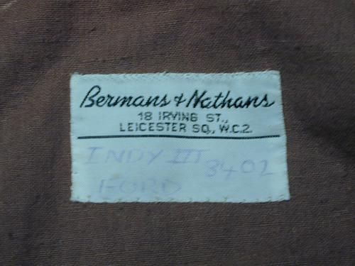
These were the same type labels as used in all jackets made through B&N. I saw a like tag in the A-2 worn by Ford in Hanover Street and made by Wested, circa 1979. No matter who made the item, B&N put their tag inside as they were the prime contractor.
Regards!Michaelson
These were the same type labels as used in all jackets made through B&N. I saw a like tag in the A-2 worn by Ford in Hanover Street and made by Wested, circa 1979. No matter who made the item, B&N put their tag inside as they were the prime contractor.
Regards!Michaelson
-
Cassidy
- Professor of Archaeology
- Posts: 1175
- Joined: Fri Apr 04, 2003 10:24 am
- Location: Oakville, Ontario, Canada...
Re: US Wings Raiders Jacket label ideas
Yes! Very good, M.
Something that looks like it came off of a movie set...any digital-artists want to take a stab at recreating something like that?
Something that looks like it came off of a movie set...any digital-artists want to take a stab at recreating something like that?
-
Texan Scott
- Legendary Adventurer
- Posts: 5838
- Joined: Sat Jun 21, 2008 8:55 am
- Location: A felt body at rest tends to stay at rest. Sieze the day!
- Contact:
Re: US Wings Raiders Jacket label ideas
Thank you, m.s. Looks great! 
...if you have a few extra minutes and don't mind, could we see what the "crate" idea might look like? I'm just curious what might appear? Don't go out of your way though, ok.
...if you have a few extra minutes and don't mind, could we see what the "crate" idea might look like? I'm just curious what might appear? Don't go out of your way though, ok.
Last edited by Texan Scott on Wed Aug 04, 2010 12:52 pm, edited 1 time in total.
-
Michaelson
- Knower of Things
- Posts: 44540
- Joined: Tue Jun 25, 2002 12:55 pm
- Location: Out here knowing stuff and things and wishing I were with the family at Universal Studios Orlando
Re: US Wings Raiders Jacket label ideas
No problem, Cassidy! I just pulled it from Castor Dioscuri's post on page one, posted last Sunday, and with the same proposal. 
Regards! Michaelson
Regards! Michaelson
-
Kentucky Blues

- Professor of Archaeology
- Posts: 834
- Joined: Thu Oct 16, 2003 4:59 pm
- Location: Kentucky
- Contact:
Re: US Wings Raiders Jacket label ideas
Indiego Jones wrote:Well....I like this idea too!Castor Dioscuri wrote:Here's my two cents:
Just something I made on a rush. It's simple, specific and clear. I don't have the correct fonts.
Everyone feel free to modify this sketch.
Thanks Sgt. for giving us the opportunity to contribute directly on this project.
Regards!
PS: realy nice m.s !

That stab has been taken, Cassidy.... but more couldn't hurt!
-KB
Edit: Please ignore Michaelson's post, he didn't realize that I was planning on posting myself
Last edited by Kentucky Blues on Wed Aug 04, 2010 12:50 pm, edited 1 time in total.
-
Rick Deckard
- Laboratory Technician

- Posts: 134
- Joined: Thu May 06, 2010 4:33 pm
Re: US Wings Raiders Jacket label ideas
I could be off base here, but I don't think LFL has trademarked the word Raiders. It's too common a word, as in the Oakland Raiders, the Texas Tech Red Raiders, Middle Tennessee State Blue Raiders etc. (Just Google the name.) Plus there's an old flight jacket from WWI (maybe WWII ?) referred to as a Raiders jacket. I would be shocked to see any type of legal trouble over such a common word.
Moreover, if a design cannot be copyrighted, then it would seem to me to be okay, irrespective of licensing, to make an "Indy" jacket and put the word Raiders on the tag. That's probably as far as a jacket maker could take it though.
The cherubim's design could certainly be copyrighted, but not the image of the Ark itself unless it's the exact image from the movie.
Eh, that's my take on it, anyway.

Re: US Wings Raiders Jacket label ideas
I still love the idea Castor brought to the table.
-
Kentucky Blues
- Professor of Archaeology
- Posts: 834
- Joined: Thu Oct 16, 2003 4:59 pm
- Location: Kentucky
- Contact:
Re: US Wings Raiders Jacket label ideas
Well, that's the problem, Rick, If we don't use the movie ark, it's just not the same...
-KB
-KB
-
Cassidy
- Professor of Archaeology
- Posts: 1175
- Joined: Fri Apr 04, 2003 10:24 am
- Location: Oakville, Ontario, Canada...
Re: US Wings Raiders Jacket label ideas
LOL. And here I am usually known for my attention to deta....HEY! Look, a squirrel!
-
Michaelson
- Knower of Things
- Posts: 44540
- Joined: Tue Jun 25, 2002 12:55 pm
- Location: Out here knowing stuff and things and wishing I were with the family at Universal Studios Orlando
Re: US Wings Raiders Jacket label ideas
SQUIRREL!!! 
-
Indyzane
- Professor of Archaeology
- Posts: 784
- Joined: Sun Mar 08, 2009 12:13 pm
- Location: Moab, Utah "Everybody's lost but me!"
- Contact:
Re: US Wings Raiders Jacket label ideas
Michaelson wrote:SQUIRREL!!!

-
Michaelson
- Knower of Things
- Posts: 44540
- Joined: Tue Jun 25, 2002 12:55 pm
- Location: Out here knowing stuff and things and wishing I were with the family at Universal Studios Orlando
-
Tennessee Smith
- Site Admin
- Posts: 10586
- Joined: Mon Jul 02, 2007 3:47 pm
- Location: Everything we need is right here.
Re: US Wings Raiders Jacket label ideas
Well, since there might be issues with any Lucasfilm artwork this might work.
I know a lot of folks here like to have their items fit the time period of the films. Raskolnikov posted an image of a military label which was awesome. I loved the threaded letters. I can't do that with my software but this is my attempt at it following the actual label from the G-1 WW II label.
I even added a nod to Indy Gear

Uploaded with ImageShack.us
-
Tennessee Smith
- Site Admin
- Posts: 10586
- Joined: Mon Jul 02, 2007 3:47 pm
- Location: Everything we need is right here.
Re: US Wings Raiders Jacket label ideas
And if we can mention Raiders... Plus I put more towards Indy Gear.


-
sharkboy
- Laboratory Technician
- Posts: 126
- Joined: Sun Jan 03, 2010 10:22 pm
- Location: New York, NY
- Contact:
Re: US Wings Raiders Jacket label ideas
my contribution for the day. Trying some vintage and monotone ideas.
SB

SB
-
Indydawg

- Moderator
- Posts: 2692
- Joined: Tue Feb 11, 2003 5:37 pm
- Location: The space between spaces
- Contact:
Re: US Wings Raiders Jacket label ideas
Man....I gotta say, TS-I like that one!!!!
Oh...by the way...did you read your Princeton Review yet?!
Go Dawgs!
Regards!
Indydawg
Oh...by the way...did you read your Princeton Review yet?!
Go Dawgs!
Regards!
Indydawg
-
Tennessee Smith
- Site Admin
- Posts: 10586
- Joined: Mon Jul 02, 2007 3:47 pm
- Location: Everything we need is right here.
Re: US Wings Raiders Jacket label ideas
Not yet, where did we rank?Indydawg wrote:Man....I gotta say, TS-I like that one!!!!
Oh...by the way...did you read your Princeton Review yet?!
Go Dawgs!
Regards!
Indydawg
And Thanks!!!
-
Indydawg
- Moderator
- Posts: 2692
- Joined: Tue Feb 11, 2003 5:37 pm
- Location: The space between spaces
- Contact:
Re: US Wings Raiders Jacket label ideas
Don't remember...I'm still reeling from finally, and "officially" having GA declared "A Drinking Town With A Football Problem!"
Regards!
Indydawg
sorry.....I'll let this thread go back on topic now....to the PM-cave, Robin!!!
Regards!
Indydawg
sorry.....I'll let this thread go back on topic now....to the PM-cave, Robin!!!
-
Indiego Jones
- Vendor
- Posts: 1042
- Joined: Thu Aug 14, 2008 5:27 pm
- Location: Argentina, Rosario
- Contact:
Re: US Wings Raiders Jacket label ideas
Having the BERMANS & NATHANS label idea in mind.
I took for inspiration the N.Howard's ToD's label.


The fonts are not perfect, but gives the idea.
Only the bottom one has the blank half, for the owner to fill up.
Regards.-
I took for inspiration the N.Howard's ToD's label.
The fonts are not perfect, but gives the idea.
Only the bottom one has the blank half, for the owner to fill up.
Regards.-