How does one go about getting one of these?
I'm talking about the shirt worn in a picture by agent5.
I've been searching the high mountains for this shirt because I dont want to wear the redundant red&yellow logo on a shirt, but rather show my appreciation for Raiders as an individual movie, unsurpassed.
If anyone has any leads, that would be great.
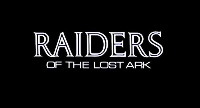
I have been working on making the logo myself using photoshop, but I can't get the main font right, because it's some ancient version of the Jenson font family, as it's pretty assymetrical. I also have a font called "Adobe Song STD" and it kinda looks like it too, apart from Jenson is has straighter sides like the logo itself but it lacks the curved sides and the extra curve on the tip of the A.
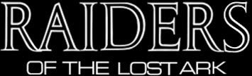
By the way - the main font is Open Capitals by Jan van Kimpen, and the subtitle is called Eurostile. You can find them online and use big samples (invert the colors to be black on white) and make a logo that way, if you don't want to buy them.
Here's a quick one I made that way (but note that I didn't make my shirt).
IndyMcFly wrote:One of these? (Keep your eyes to the left!)
PM sent.
By the way - the main font is Open Capitals by Jan van Kimpen, and the subtitle is called Eurostile. You can find them online and use big samples (invert the colors to be black on white) and make a logo that way, if you don't want to buy them.
Here's a quick one I made that way (but note that I didn't make my shirt).
Shane
Why Shane, Why. She's soooo much better looking than you. giggity.
EDIT - What are the circumstances regarding the discovery of the font? I always thought it was a mystery, so the fact that it's been found is pretty darn cool.
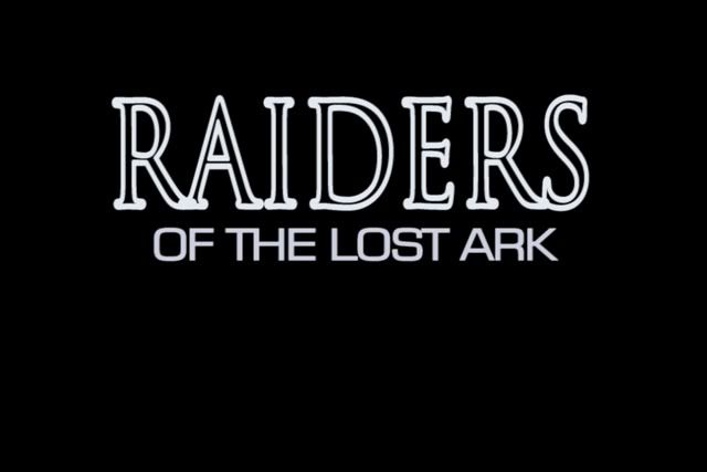
Hmm, I should probably make a vector version of the text someday. If anybody has some HD or high res screencaps of the text posting them would be most appreciated.
I'd say it's spot on. I'm not 100% sure, as it might only be an optical illusion, but the serifs of the Rs seem to be a bit more curved upwards on the title screen.
Yeah that's where I'll need the HD screencaps (agent5?) to make sure if they are supposed to curve up or not. Also most of the serifs are a tad too long, I'll need to shorten them a bit.
Yeah so to me, it looks as if the serifs were bent more heavily on the Rs (upwards) and slightly bowed on the serifs below.
I'm actually totally fascinated at the spacing between the letters. It's surprisingly irregular.
And the Eurostile seems to be rounder than the preloaded one.
I just checked with my copy of OpenKapitalen. it's interesting because itseems to be the same font but in bold or something. the open part of the capitals is pretty consistent with the logo, nothing a bit of stretching vertically wouldn't fix, but the capitals themselves are too thin. Maybe they doubled them over. Oh and OpenKapitalen's serifs are way too straight. At least on the bottom.
mufflowne wrote:Yeah so to me, it looks as if the serifs were bent more heavily on the Rs (upwards) and slightly bowed on the serifs below.
I'm actually totally fascinated at the spacing between the letters. It's surprisingly irregular.
And the Eurostile seems to be rounder than the preloaded one.
I just checked with my copy of OpenKapitalen. it's interesting because itseems to be the same font but in bold or something. the open part of the capitals is pretty consistent with the logo, nothing a bit of stretching vertically wouldn't fix, but the capitals themselves are too thin. Maybe they doubled them over. Oh and OpenKapitalen's serifs are way too straight. At least on the bottom.
What is interesting to me is that the text on Raiders was probably originated on a photosetter and then recomposited back over the neg. Some rounding off and blurring would be expected.
The cut on the photosetter may be slightly different too.
Given the time period, the logo was probably hand-drawn, which would explain any inconsistencies with the typeface it was based on. Remember, computers weren't used for titling graphics during the period when Raiders was produced.
I have one of the shirts from that run, and I think this graphic had something to do with it's creation, but I'm not sure. Agent5 will remember more obviously.
I mean this is really all about nitpicking at the logo. ####, the whole forum is about nitpicking.
But
Given the time period, the logo was probably hand-drawn, which would explain any inconsistencies with the typeface it was based on. Remember, computers weren't used for titling graphics during the period when Raiders was produced.
*EDIT* And what KT said.
Yeah, but when you see the opening credits in HD, you'll see that the inconsistencies are consistent. They're actually amazing, because they're subtle things that would be considered type-setting errors nowadays. I love them to death though, they even give the title and the opening credits character, just like the #### hat.
Although, I don't really think they were hand-drawn. They probably had a template for each letter.
So, Back to the question,where did those black "raiders" shirts we're seeing come from? They are very cool. I'm sure they'd sell well among COW. :idea:
It's nice to see there are others out there who love the look of this logo as much as I do. IMHO, it's much more edgy and suggestive of adventure in exciting, undiscovered locations than the in-your-face, red and yellow comic book letters of later Indy movies.
Anyone else notice how the word "RAIDERS" tends to change shape and lose meaning the longer you stare at it ... ? It's quite hypnotic ...
I actually don't like the red & yellow Indiana Jones logo at all. It's too comic-booky, while the Raiders logo actually feels like it came off an adventure novel or something. (Yeah, i know, raiders of the something else book)
Besides, they use that red&yellow type for everything that has anything even remotely to do with any kind of adventure at all. Which just makes me despise it.
Agreed. I think the red and yellow letters were introduced to help Indy appeal to a much younger audience. They certainly look at home on kids' lunchboxes.
Michaelson wrote:They were made by an enterprising individual who made them available to several folks a few years back that apparently wishes to remain anonomous.
And yes, I own one too.
Regards! Michaelson
Dear Anonymous, Raiders of the Lost Ark t-shirt wanted. Inquire within..............
Someone who is a member over at the RPF should seek ssdesigner
Top notch shirts...I used to be a member over there a long time ago, in a galaxy far away. Registration has been closed for some time though.
R
Someone needs to start making these shirts man, cause I want one. I guess I could just buy a shirt press, that presses the image onto the shirt. I know my professor in college she bought one, but I am not sure if she still has it or not. I think they are like a couple hundred dollars. I mean if you think about it, you buy the press and you sell the shirts for 10-15 bucks, you could probably easily make your money back if there was enough interested people in buying a shirt Well at least the idea is thrown out there. If anyone is making any of these shirts let me know.
I will look into making or having some of these made up by a friend. My only question is, would it be legal to use the raiders name and sell it on a shirt.


