Page 2 of 5
Posted: Mon Nov 12, 2007 9:56 am
by Kt Templar
agent5 wrote:I personally don't like that idea and I'll tell you why. We know it's a shirt so to put the word shirt on it seems sort of redundant. Second, it's not field tested yet so that's kind of a misuse of words. Now, if Marc had been wearing one for a year or so, that may be different.
Just my opinion.
How about...
Adventurebilt
Custom Quality
I was going to look a British military shirt I've got but never got round to it it does say blatantly obvious stuff on it like "Light Brown Shirt".
Trying to avoid being too po faced here folks!

JMO.
Posted: Mon Nov 12, 2007 10:58 am
by VP
djd wrote:I fancy 'Adventurebilt - Raider' or Crusader...
Raider sounds better, this is, after all, a RotLA shirt.
Posted: Mon Nov 12, 2007 1:56 pm
by Marc
Naaaa... no movie titles IMO. That is too Disney

I like 5's idea though. Let's see what Kim comes up with considering all the input. He's working on it as we "speak"

Regards,
Marc
Posted: Mon Nov 12, 2007 2:11 pm
by Satipo
Hmm. I'm not sure you should use the word "custom" because the shirts are already designed and made before the customer places an order. To me, "custom" suggests a shirt made to the customer's specifications. These shirts are essentially off-the-rack. Or am I mistaken? Now, the AB fedoras could be described as custom because they are made according to the individual. Perhaps "Traditional Quality" would be more appropriate here.
Posted: Mon Nov 12, 2007 2:25 pm
by Michaelson
I've read more wrangling about the wording of this label than the design and delivery of the entire AB shirt line!


Regards! Michaelson
Posted: Mon Nov 12, 2007 3:01 pm
by Falcon
Michaelson wrote:I've read more wrangling about the wording of this label than the design and delivery of the entire AB shirt line!
I agree.
How about:
Shirt
Nothing else. Brief and to the point.

Excuse me while I go hide in the corner.

Posted: Mon Nov 12, 2007 8:14 pm
by Johnny Fedora
Just Adventurebilt. Although, now that I think about it...There's Adventurebilt, Adventurebilt Delux, And now Adventurebilt Leather. How about Adventurebilt Outfitters for the clothing line? Round AB symbol with the name around the outside just like the AB Leather logo. What do you think?
Johnny
Posted: Thu Nov 15, 2007 7:37 am
by PLATON
I vote for the original idea
DEDICATED
Adventurebilt
Posted: Thu Nov 15, 2007 9:33 am
by Kaplan
PLATON wrote:I vote for the original idea
DEDICATED
Adventurebilt
HEAR, HEAR!!!

Posted: Thu Nov 15, 2007 9:40 am
by Satipo
Kaplan wrote:PLATON wrote:I vote for the original idea
DEDICATED
Adventurebilt
HEAR, HEAR!!!

NO! DON"T DO IT!

Posted: Thu Nov 15, 2007 10:21 am
by Marc
I think the design is done now...
We only have to decide on what background color would be best yet. The burgundy as on the vintage HJs / AB-Dlx. or a beige one to match the color of the shirt.
I'll show it to you soon. Thanks for your highly appreciated input.
Regards,
Marc
Posted: Thu Nov 15, 2007 11:02 am
by VP
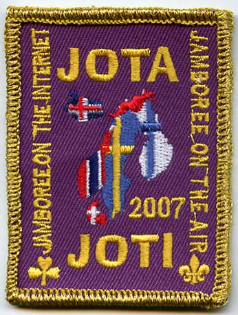
Burgundy and gold letters, kinda like this badge here:

Posted: Thu Nov 15, 2007 11:13 am
by Kt Templar
Hey VP, that background is purple.
Does your wine come in that colour? Or just your grape juice?
But burgundy and gold is a nice traditional combo. Although I am slightly concerned it might show through the back of the shirt?
Posted: Thu Nov 15, 2007 11:15 am
by Castor Dioscuri
I'd go with beige... makes it more subtle.
Posted: Thu Nov 15, 2007 11:20 am
by VP
Kt Templar wrote:Hey VP, that background is purple.
Does your wine come in that colour? Or just your grape juice?
I don't drink wine, and who of us was the color blind one?

Posted: Thu Nov 15, 2007 11:23 am
by Kt Templar
VP wrote:Kt Templar wrote:Hey VP, that background is purple.
Does your wine come in that colour? Or just your grape juice?
I don't drink wine, and who of us was the color blind one?

I know... just playing with ya!

Posted: Thu Nov 15, 2007 11:27 am
by Castor Dioscuri
For some reason, I am starting to think of Wested's label
 http://indyville.fi/kuvat/gear/gear_takki_logo.jpg
Hopefully the label won't be too scratchy though... The best labels are seen and not felt

Posted: Thu Nov 15, 2007 11:29 am
by VP
Posted: Mon Nov 19, 2007 5:01 am
by ShanghaiJack
Marc wrote:I think the design is done now...
Shoot! I was going to suggest sending out a blank label and sharpie marker with every shirt. That way everyone could have whatever label they wanted and I'd get my shirt sooner!

I do think that beige would be a better color for the label though. Something that will blend in with the shirt and also will lessen the likelihood of the dye running if it is washed in hot water.
Posted: Mon Nov 19, 2007 10:53 am
by Marc
Dear all,
after taking all your input and our own into consideration and wanting to keep things "vintage style", this will be what the label for the shirts will look like:
Image removed again due to not reasons written below 
Hope you like it.
Regards,
Marc
Posted: Mon Nov 19, 2007 10:56 am
by Kt Templar
Very smart!


Posted: Mon Nov 19, 2007 10:58 am
by djd
Looks very nice. Great job
Posted: Mon Nov 19, 2007 11:29 am
by Canada Jones
Wow! A long way from the original design and I like it ALOT better. Class. Vintage. Quality. Oh and very Indy.
best
Canada
Posted: Mon Nov 19, 2007 11:55 am
by Marc
Thanks a lot

This pretty much sums up, what we were looking for (after the original was turned down, but that's why I asked to start with

).
The credit is due to Kim aka Kontherun aka Mr. Adventurebilt Leather Co. - Thanks a lot my friend.
Regards,
Marc
Posted: Mon Nov 19, 2007 12:04 pm
by Michaelson
Home run, Marc, K. Looks like a professional job now!
HIGH regards! Michaelson
Posted: Mon Nov 19, 2007 12:07 pm
by Panama Tom Jr.
Very, very nice - this new logo keeps a nice continuity with the hats and the holsters...
Posted: Mon Nov 19, 2007 12:40 pm
by KingNothing
Very cool logo!!
Posted: Mon Nov 19, 2007 12:42 pm
by Indiana G
very nice.........so since people are bound to ask about the writing on the headpiece......is that the side that has the "warning not to disturb the ark of the covenant" and the staff is 6 kadams (sp?) high....or is that the "take back one kadam to honor the hebrew god" side?
Posted: Mon Nov 19, 2007 12:45 pm
by Satipo
Very nice! Classy and to the point. The Staff of Ra headpiece design references Raiders in a subtle, not-in-your-face sort of way, thereby avoiding any kids' costume implications. It actually reminds me of the classic Metro Goldwyn Mayer logo. Excellent work!

Posted: Mon Nov 19, 2007 1:14 pm
by VP
Indiana G wrote:very nice.........so since people are bound to ask about the writing on the headpiece......is that the side that has the "warning not to disturb the ark of the covenant" and the staff is 6 kadams (sp?) high....or is that the "take back one kadam to honor the hebrew god" side?

Every gearhead should know that the front side (warning) has more text. Although according to
http://indygear.com/props/artifacts.shtml the Imam had the headpiece the wrong way around.

Nice label design, looking forward to the measurements.

Posted: Mon Nov 19, 2007 2:57 pm
by Indy Magnoli
Looks good... yes, that side reads, "Honor God and the tabernacle (Ark). One Amah above (on top of) the Kadam." Why is there a letter missing in the last word?

Kind regards,
Magnoli
Posted: Mon Nov 19, 2007 3:12 pm
by Marc
Ummmmm.... 8-[ Kim? Please?
Regards,
Marc
Posted: Mon Nov 19, 2007 3:25 pm
by Indy Magnoli
Heck... nine replies by Gearheads and no one noticed the missing letter. Don't think many would.

Regardless, this is a great design and more fitting to the Adventurebilt name, in my opinion.
Kind regards,
Magnoli
Posted: Mon Nov 19, 2007 4:01 pm
by Marc
Well, I certainly appreciate that you pointed it out Indy!!!
Thanks a lot,
Marc
Posted: Mon Nov 19, 2007 4:04 pm
by Indy Magnoli


-Magnoli
Posted: Mon Nov 19, 2007 4:06 pm
by Michaelson
Heck, I thought it was left off to avoid any copyright issues. 8-[
Regards! Michaelson
Posted: Mon Nov 19, 2007 4:24 pm
by Indiana G
thanks for the clarification vp and mags.....i knew that the imam had the head piece the wrong way...i just couldn't recall which side.....guess that michaelson disease is catchy........huh??? now what were we talking about again??? boots or something????
Posted: Mon Nov 19, 2007 4:26 pm
by Michaelson


Regards! Michaelson
Posted: Mon Nov 19, 2007 4:45 pm
by MisterJones
Marc wrote:
Hope you like it.
Regards,
Marc
Indeed, it looks very good. Very good.

Regards.
Posted: Mon Nov 19, 2007 5:39 pm
by K on the run
Oh I've been busy at the shop all night. Yes indeed there's a letter missing. I'll look for it in the morning and put it back where it belongs.

Kim
Posted: Mon Nov 19, 2007 7:33 pm
by Bufflehead Jones
Hey, on the headpiece on the label, did anyone notice that there is a letter missing from one of the words?
Posted: Mon Nov 19, 2007 7:53 pm
by Indiana Kev
The new label is great. Nice work!
hat
Posted: Mon Nov 19, 2007 9:17 pm
by BendingOak
marc, that the name and logo that we all come to love and trust. great job.
Posted: Mon Nov 19, 2007 10:16 pm
by Gater
I LOVE IT!! great job!!!
Posted: Mon Nov 19, 2007 10:16 pm
by ShanghaiJack
Nice, elegant, and understated. Perfect!

Posted: Tue Nov 20, 2007 3:45 am
by K on the run
Bufflehead Jones wrote:Hey, on the headpiece on the label, did anyone notice that there is a letter missing from one of the words?
I found it Buff, stuck under my shoe. It's back where it belongs and I just mailed the final version to Marc.

Kim
Posted: Tue Nov 20, 2007 9:37 am
by Michaelson
Bufflehead Jones wrote:Hey, on the headpiece on the label, did anyone notice that there is a letter missing from one of the words?

Come here, Buff! Have a seat by me and drink your coffee.

Regards! Michaelson
Posted: Tue Nov 20, 2007 12:44 pm
by Ken-Obi Wanabi
Looks great! Very well thought out.
Posted: Wed Nov 21, 2007 1:23 am
by Bufflehead Jones
K on the run wrote:Bufflehead Jones wrote:Hey, on the headpiece on the label, did anyone notice that there is a letter missing from one of the words?
I found it Buff, stuck under my shoe. It's back where it belongs and I just mailed the final version to Marc.

Kim
K, it must not have been glued on good enough.
Posted: Wed Nov 21, 2007 1:25 am
by Bufflehead Jones
Michaelson wrote:Bufflehead Jones wrote:Hey, on the headpiece on the label, did anyone notice that there is a letter missing from one of the words?

Come here, Buff! Have a seat by me and drink your coffee.

Regards! Michaelson

Okay. Can you pass me the cream and sugar, please?


