hey KT,
thanks for showing us,it's pretty cool.I love history and what we are seeing here is pure history. I think Peter should have them sealed in plastic or glass to perserve them for future showings. One question when you had the jacket on how did it feel,not by material but actually wearing "the jacket" must have been cool.
jacksdad wrote:hey KT,
thanks for showing us,it's pretty cool.I love history and what we are seeing here is pure history. I think Peter should have them sealed in plastic or glass to perserve them for future showings. One question when you had the jacket on how did it feel,not by material but actually wearing "the jacket" must have been cool.
It was a one off opportunity, the jacket is going back to Anthony Powell.
It felt scary, the jacket does feel fragile and it's coming apart in various places, I was very aware of my watch when threading through the sleeves.
And I've just realised, that's the single most valuable Item I will ever wear!
I would say an estimated $25,000 - $50,000 easily. Maybe more. Hard to tell with the market the way it is but it is one of few jackets worn in the film. Even so, TOD is the least liked film in the series by many which is what I've been told by various action houses when I tried to sell some of my TOD memorabelia.
I would say ALOT more than that.
This isn't just any prop. This is the HERO jacket from an Indiana Jones Movie, one of the most iconic pieces from those movies. least liked or not, Hero jacket worn by Ford. I think this is worth A lot more than 25 k- 50 k
Were those buttons replacements? Those are olive green British army buttons.
I love the epualettes, they look to be 'Raiders' length.
KT, what did the label say in this shirt? I saw a pic of one of the TOD shirts and it had a Western Costume label in it. Is that this shirt? Also, what makes the pleats on this shirt different from current offerings? Are the pleats an extra piece of fabric sewn to the front?
Did you take any photos of Wested's versions next to the originals?
That's a missed opportunity if you didn't because it would help everyone to see once and for all how close / far off the Wested replicas are.
Did you take any photos of Wested's versions next to the originals?
That's a missed opportunity if you didn't because it would help everyone to see once and for all how close / far off the Wested replicas are.
Cheers,
Chris
Ah, Unfortunately not. I was just concentrating on taking in the jacket details.
(would have been tempting to take a little snipped of either the shirt or the pants, no one would have missed it But .... lol of course I didn't!)
We all know that the Wested shirts are too yellow and the details a little soft.
But Peter will have all of the old NH stock soon. Hopefully he'll keep one of each as a record, I know he has umpteen photos... Did you notice his patterns? Each element has an accompanying pic.
Nice pics! I insist in my belief that these items, in my opinion, are Raiders clothes. This shirt has diagonal offset epaulettes with the points squared off. The button colours are correct for this shirt.
When I redyed my Wested shirt to the NH colour, guess what, the white buttons came out identical in colour as the ones above(a mix of greyish-green)...not only that. I took a picture with my old camera under sunlight and the button-shirt tones came out close as in Raiders.
I really believe that when Raiders was shot the colour settings or quality of the picture was of a B-movie.
So do I Bink. But..... only the tag in the jacket says Raiders II.
Regards, Geert
EDIT: not that I strongly believe they are Raiders clothes, but I know why people would think so. And judging by the abcense of Raiders II on the labels, it could even be possible.
I am with you on your last. Of course everyone can believe as he/she desires as binkmeisterRick very correctly stated.
Let me support my argument as follows with no offence whatsoever.
1) The epaulettes have a diagonal shape with the points squared. The ToD had the points pointed if I remember correctly.
2) The epaulettes are longer than the ToD.
3) The stitching of this shirt is simple. ToD stitching(at least on the side of the shoulders) was reinforced as modern shirts since the major action sequences were shot without the jacket.
Mechanic, I think that the buttons are indeed original. They aren't a replacement. If you take in consideration the colour of the pants, these buttons make exellent contrast with them. When I shot my redyed Wested shirt with the Wested pants with the jacket the buttons' colour came out similar to the shirt. I can post this picture if you want. In my opinion, is one of the optical illusions that the photo camera does.
Indygr
Wested must have changed their buttons because when I re-dyed my Wested shirt the buttons were still almost white. I changed them out.
I think the shirt above has buttons that are way too dark to be the original Raiders buttons but that's just my opinion.
See, I don't think there's any way the original buttons were dark O.D. Green- they were more a greyish tan. Those are the raiders epualettes though.
I think it writes 2876 - 1 on the shirt and 2876 - 2 on the trousers. Maybe it was their pattern #2876...or their product #2876. Number 1 and 2 might mean that they came in pairs. NH had this also when he was in MBA but it was a bigger number. It seems like when they are doing costumes they have to justify them in the Tax authorities ...just a thought.
Hey Mechanic, check also my pic...it's shot with an old Cybershot 1.6 Mpix The buttons are green, but they have a greyish colour there.
I've always thought the buttons on the Raiders shirt were very close in color to the shirt itself (give or take a shade) and that the other films had more of a button contrast. My 'raiders' from MBA is that way, the buttons are a slightly pinkish flesh tone, close to the shirt color. I particularly believed the LC shirt to have darker buttons.
About the Western Costume tags in the shirt and pants - why? I thought WC was based in the US, and the designs were from B&N... so why no B&N lables like in the US made jacket (which should have the WC lable if anything). That all seems backwards.
I could be wrong, as it was about ten years ago, but I seem to remember Noel telling me something about the shirt being designed by Andre Dometakis and then produced by Western Costumes.
On another note, I'd say on Noel's shirt, the button placement in relation to the pockets reflects the Raiders placement rather than TOD's. Note the third button roughly lining up with the pocket flap button and the fourth button being around the height of the pocket bottoms.
I think the pocket dimensions on Noel's more closely resemble the Raiders ones, with their longer (top to bottom) flaps and bodies (see the last picture).
Also, as indygr pointed out, the TOD shirt appears to have a double stitched shoulder seam, which is absent on both the Raiders and Noel's shirt.
I think we're definitely looking at a Raiders shirt with different buttons on it. The stitching, the epaulettes, the Western costume label, all makes sense.
Western Costume is in L.A. Back in the day you could actually rent movie costumes from them. I know a guy who back in the late 70's rented Charlton Heston's "Planet of the Apes" flightsuit for a week. He took lots of photos, measurements,and has his pictures taken with it on.
Those were the days.
So then the question again is why does the shirt and pants who's designers are based in London have labels from the US based costume house. Just seems like odd. While the jacket, from the US based company (cooper) has the London based costumer's label?
Indiana Strones wrote:
IMO Wested shirts are too white, not too yellow. Todd's are too yellow!
Here, here, my good man, you're exactly right.
Sorry guys, both of you are confusing saturation with hue.
The hue of a Wested isfurther into the yellow of the colour wheel and the Todd is further into both the yellow and the red. These are professional terms.
The "whiteness" is the saturation, the lack of colour.
Strones, you will have done classic colour theory, Big Rex I'm not sure what you do so I don't know if you will have.
Well, I'm not a colour physician or an expert in the field. I say only what I see, and I see the Wested shirt too white: I can't see any yellow there. I see a lot of yellow in my Todd shirt...
And I'm not sure that the definition of "saturation" is "the lack of colour". May be I'm wrong.
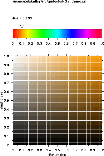
Maybe this will help a bit. Or not. Anyway, the bar at the top shows the hue, or colour. (The arrow points to the colour chosen from the full spectrum of colours, which is the ochre used in the chart beneath it.)
If you look at the top row of the second chart, all the way to the upper right corner is the colour at 100%, or full strength, if you will. As you move across the top and back to the left, you'll notice the colour gets more pale or whiter. This shows the colour becoming less saturated. You can also think of it this way, if you take red food dye, you see it at full saturation. Once you start adding more and more water to the dye, it becomes less red and more pink. This is because the red dye is becoming less saturated.
As you move to the bottom of the chart, you notice the colour becoming more black. This is due to the brightness of the colour.
Kt Templar wrote:But Peter will have all of the old NH stock soon. Hopefully he'll keep one of each as a record, I know he has umpteen photos... Did you notice his patterns? Each element has an accompanying pic.
As far as the pants go, I might have a picture of my NH pants laying on top of these pants (I'll go look) -- but they were basically identical. The material NH used was perfect in both color and weave.
Also, the construction of the pants also identical - the waist lining, fly buttons etc.
I didn't spend as much time with the shirt - very, very fragile, compared to the jacket.
Last edited by ANZAC_1915 on Sat Sep 06, 2008 9:07 pm, edited 1 time in total.
It would be great if you could provide us a pic of these pants on top of the NH ones.
But, I have also an other request...do you have a pic with the MBA Raiders pants vs. these actual raiders pants?? From what I understood...Noel changed his supplier and then he was offering the Raiders pants as Wested did.
If the MBA raiders pants were not similar to the actual Raiders this means that Noel in the beginning chose a garment that he perceived to be screen-accurate...just simple curiosity!
I'm a graphic designer. I understand what you're talking about and I agree. More white is the absence of color or saturation as you put it. I don't own a Wested, but from the photos I've perused, it does always look washed out even if it in fact yellower with less saturation and less of everything else.
Kt Templar wrote:
bigrex wrote:
Indiana Strones wrote:
IMO Wested shirts are too white, not too yellow. Todd's are too yellow!
Here, here, my good man, you're exactly right.
Sorry guys, both of you are confusing saturation with hue.
The hue of a Wested isfurther into the yellow of the colour wheel and the Todd is further into both the yellow and the red. These are professional terms.
The "whiteness" is the saturation, the lack of colour.
Strones, you will have done classic colour theory, Big Rex I'm not sure what you do so I don't know if you will have.
indygr wrote: But, I have also an other request...do you have a pic with the MBA Raiders pants vs. these actual raiders pants?? From what I understood...Noel changed his supplier and then he was offering the Raiders pants as Wested did.
My pants were custom made (Raiders style) by NH (not MBA era) for me last year, and I laid them on top of his screen used pants (I believe they were used in ToD). I will try and dig up the photo. They were pretty much identical - very very slight color difference which could have been fading of the original.
Satipo wrote:What about the pocket flaps, ANZAC_1915 - were they identical?
Pants pockets yes - did not examine the shirt and compare to mine so closely as I picked them up at different times (had to wait for pants). And I realize we're taking this off the shirt topic but they are pretty much linked.
All this just confirms what we already knew: NH worked on the films, had access to screen used costumes, and went to a lot of detail both on material and pattern to make very good copies of what was used on the screen. Noel really was a perfectionist.
I just finished watching Raiders for the umphteenth time and I noticed something interesting. I can't make screencaps, so I'll just tell you guys where too look.
when Indy is on the roof at Sallah's place and they are talking about the dig, right after Sallah says "we call him Bellosh" you see Indy laughing. When Indy laughs he tilts his head forward, which causes the sunlight to hit the button on his right shoulder, and right there it turns olive green!
I've gone back an forth over this little bit of the movie a dozen times, frame by frame, and it keeps looking olive green when the sun hits it, only to revert to the greish tan when it is covered by the shadow of his head.
It may not be interesting to you, but I thougt I should post this.
ANZAC_1915, that's interesting regarding the pants pocket flaps. My MBA Raiders pants are very nice, but don't have Raiders SA flaps. More LC, I think.
gwyddion, that sounds interesting. It would be funny if the Raiders shirt button colour turns out to be olive green rather than the greyish cream it generally appears.